





The smart 😎, tiny 📦, and flexible 🎗 bottom sheet your app craves 🚀
👉🏾


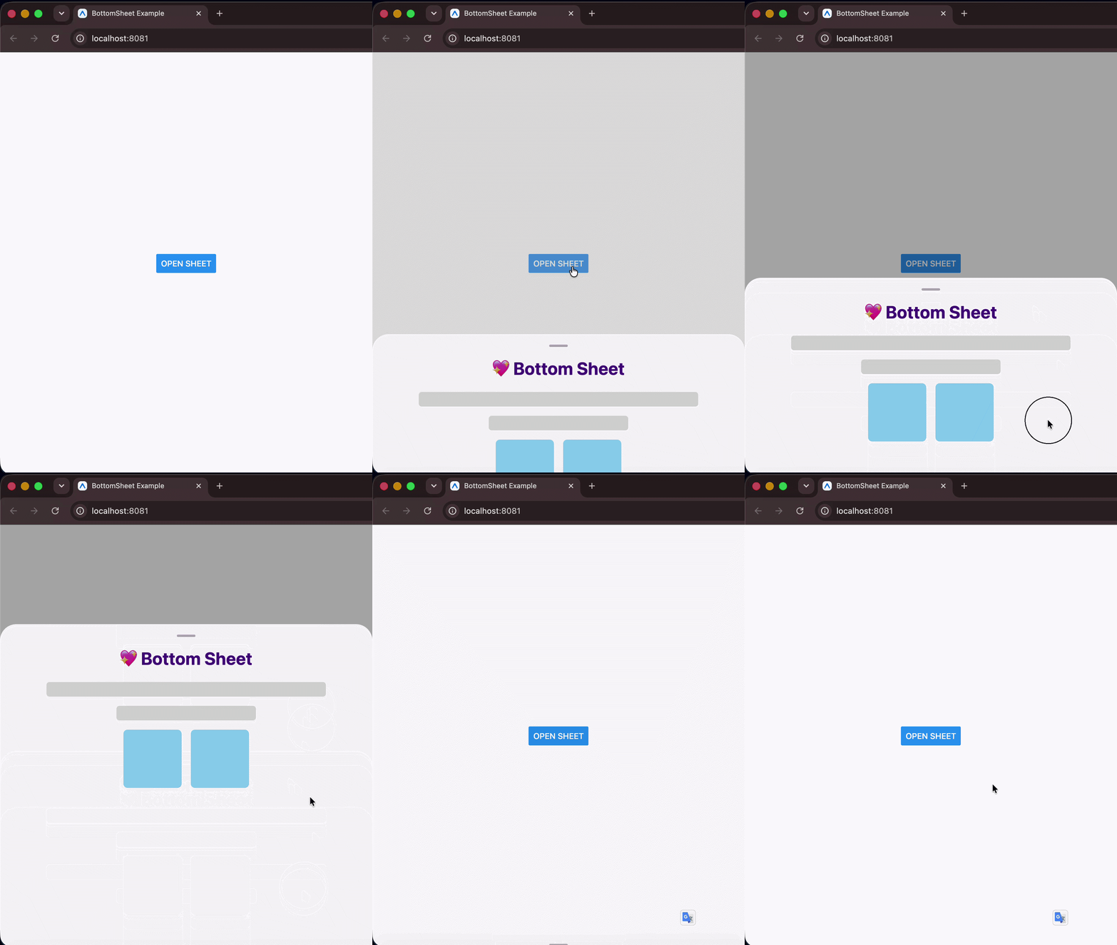
npm install @devvie/bottom-sheet
# or
yarn add @devvie/bottom-sheet🚀 Zero dependencies — npm install and you're done. No third-party dependencies, no Babel plugins, no pod install. Built entirely on React Native's own APIs. Just plug and play.
⌨️ Keyboard intelligence — The sheet auto-detects the keyboard mode (adjustPan / adjustResize), measures its own live position on screen, and animates to a safe height when a text input is focused — all without any configuration or wrapper components.
📦 Tiny footprint — ~4 KB minzipped. Extremely lightweight and fast, leaving virtually no impact on your bundle size.
🎯 Snap points — Define resting positions with a mix of % and px values. Snap points are automatically sorted in ascending order internally, meaning index 0 always represents the smallest/collapsed position. The sheet snaps to the nearest point on release with velocity-aware physics, and exposes snapToIndex, expand, and collapse for full programmatic control.
📟 Live prop updates — Dynamically change height, snapPoints, or containerHeight at any time and the sheet re-syncs its layout, clamps its active index, and fires callbacks automatically.
🌐 Truly cross-platform — iOS, Android, Web, and Expo, all from pure React Native primitives. No native modules required.
🎞 3 animation types — Choose between slide, spring, and fade out of the box, or supply your own custom easing function. Animation durations are fully configurable for both open and close transitions.
📜 Nested scrolling — Works with FlatList, SectionList, and ScrollView inside the sheet. Drag the handle to move the sheet; scroll the list to scroll its content — no gesture conflicts.
🎨 Custom components — Swap the drag handle or backdrop with your own animated components. Both receive the sheet's animated height value for interpolation, so you can build rich interactive handles and scrims.
✨ Modal & non-modal — Use as a full modal with backdrop mask, or as a lightweight inline sheet with elevation shadow. Supports custom backdrop components positioned above or behind the sheet.
✅ TypeScript-first — Fully typed props with compile-time safety. height and snapPoints are enforced as mutually exclusive at the type level.
Opening and closing the bottom sheet is done imperatively. Pass a ref to the bottom sheet and call the open() or close() methods.
import React, { useRef } from 'react';
import BottomSheet, { BottomSheetMethods } from '@devvie/bottom-sheet';
import { Button, Text, View } from 'react-native';

const App = () => {
  const sheetRef = useRef<BottomSheetMethods>(null);
  return (
    <View style={{ flex: 1, justifyContent: 'center', alignItems: 'center' }}>
      <Button title="Open Sheet" onPress={() => sheetRef.current?.open()} />
      <BottomSheet ref={sheetRef} height={300}>
        <Text>
          The smart 😎, tiny 📦, and flexible 🎗 bottom sheet your app craves 🚀
        </Text>
      </BottomSheet>
    </View>
  );
};

export default App;import React, { useRef } from 'react';
import BottomSheet, { BottomSheetMethods } from '@devvie/bottom-sheet';
import { Button, Text, View } from 'react-native';
const App = () => {
const sheetRef = useRef<BottomSheetMethods>(null);
return (
<View style={{ flex: 1, justifyContent: 'center', alignItems: 'center' }}>
<Button title="Open Sheet" onPress={() => sheetRef.current?.open()} />
<BottomSheet
ref={sheetRef}
snapPoints={['30%', 450, '90%']}
index={0}
onSnap={(index) => console.log('snapped to', index)} // index 0..2, or -1 on close
>
<Text>Drag me between snap points 🎯</Text>
</BottomSheet>
</View>
);
};
export default App;The bottom sheet component uses and handles pan gestures internally, so to avoid scroll/pan misbehavior with its container, DO NOT put it inside a container that supports panning e.g ScrollView. You can always put it just next to the ScrollView and use React Fragment or a View to wrap them and everything should be okay.
<ScrollView>
  <BottomSheet>...</BottomSheet>
</ScrollView><>
<ScrollView>...</ScrollView>
<BottomSheet>...</BottomSheet>
</>The bottom sheet is highly configurable via props. All props works for both Android and iOS except those prefixed with android_ and ios_, which works for only Android and iOS respectively.
| Property | Type | Default | Description | Required |
|---|---|---|---|---|
android_backdropMaskRippleColor |
string | OpaqueColorValue |
Color of the ripple effect when backdrop mask is pressed (Android Only). | No | |
android_closeOnBackPress |
boolean |
true |
Determines whether the sheet will close when the device back button is pressed (Android Only). | No |
animationType |
'slide' | 'spring' | 'fade' | ANIMATIONS |
'slide' |
Animation to use when opening and closing the bottom sheet. | No |
backdropMaskColor |
string | OpaqueColorValue |
'#00000052' |
Color of the scrim or backdrop mask. | No |
children |
ViewProps['children'] | React.FunctionComponent<{_animatedHeight: Animated.Value}> |
null |
Contents of the bottom sheet. | Yes |
closeDuration |
number |
500 |
Duration for sheet closing animation. | No |
closeOnBackdropPress |
boolean |
true |
Determines whether the bottom sheet will close when the scrim or backdrop mask is pressed. | No |
closeOnDragDown |
boolean |
true |
Determines whether the bottom sheet will close when dragged down. | No |
containerHeight |
ViewStyle['height'] |
DEVICE SCREEN HEIGHT |
Height of the bottom sheet's overall container. | No |
customBackdropComponent |
React.FunctionComponent<{_animatedHeight: Animated.Value}> |
null |
Custom component for sheet's scrim or backdrop mask. | No |
customBackdropPosition |
"top" | "behind" |
'behind' |
Determines the position of the custom scrim or backdrop component. 'behind' puts it behind the keyboard and `'top'`` puts it atop the keyboard. |
No |
customDragHandleComponent |
React.FC<{_animatedHeight: Animated.Value}> |
Custom drag handle component to replace the default bottom sheet's drag handle. | No | |
customEasingFunction |
AnimationEasingFunction |
ANIMATIONS.SLIDE |
Custom easing function for driving sheet's animation. | No |
disableBodyPanning |
boolean |
false |
Prevents the bottom sheet from being dragged/panned down on its body. | No |
disableDragHandlePanning |
boolean |
false |
Prevents the bottom sheet from being panned down by dragging its drag handle. | No |
dragHandleStyle |
ViewStyle |
Extra styles to apply to the drag handle. | No | |
height |
number | string |
'50%' |
Height of the bottom sheet when opened. Relative to containerHeight prop |
No |
hideDragHandle |
boolean |
false |
When true, hides the sheet's drag handle. | No |
index |
number |
0 |
Snap point index the sheet opens to (when snapPoints is set). 0 is the smallest point. Initial position only (not reactive). |
No |
modal |
boolean |
true |
Determines whether the sheet is a modal. A modal sheet has a scrim or backdrop mask, while a standard (non-modal) sheet doesn't. | No |
onSnap |
(index: number) => void |
Called when the sheet settles on a snap point (drag or programmatic); -1 on close. |
No | |
openDuration |
number |
500 |
Duration for sheet opening animation. | No |
snapPoints |
(number | string)[] |
undefined |
Resting positions, a mix of px numbers and '%' strings e.g. ['30%', 600]. Takes precedence over height. Snap via drag or ref methods. |
No |
style |
Omit<ViewStyle, 'height' | 'minHeight' | 'maxHeight' | 'transform:[{translateY}]'> |
Extra styles to apply to the bottom sheet. | No |
The sheet's ref exposes the following methods:
| Method | Description |
|---|---|
open() |
Open the bottom sheet (to the index prop if snapPoints is provided, otherwise height). |
close() |
Close the bottom sheet. |
snapToIndex(index) |
Animate to the snap point at index (clamped). -1 closes; opens the sheet if it is closed. |
expand() |
Animate to the largest snap point. |
collapse() |
Animate to the smallest snap point. |
sheetRef.current?.open(); // open sheet
sheetRef.current?.close(); // close sheet
sheetRef.current?.snapToIndex(2); // jump to the 3rd (largest) point
sheetRef.current?.expand(); // largest point
sheetRef.current?.collapse(); // smallest point
When
snapPointsis not provided these methods resolve to the singleheight, so they're always safe to call.
Flexibility is a focus for this bottom sheet, these few examples shows certain behaviors of the bottom sheet and what can be achieved by tweaking its props.
| Android | iOS |
|---|---|
 |
 |
| Android | iOS |
|---|---|
 |
 |


See the contributing guide to learn how to contribute to the repository and the development workflow.
MIT
see LICENSE

</> with 💖 by Devvie ✌